The Art of the Movie Poster: A Visual History

Long before trailers became the primary way of marketing films, movie posters were the first and often only visual hint of what awaited audiences in theatres. A great movie poster does more than promote a film—it becomes part of the film’s identity, sparking intrigue and setting the tone for what’s to come. Over the decades, the art of the movie poster has evolved significantly, reflecting changes in design trends, printing technology, and marketing strategies. In this blog, we’ll take a journey through the evolution of movie poster design, showing the art of the movie poster and highlighting iconic posters and the talented artists behind them.
The Early Days: 1900s–1920s
In the early days of cinema, posters were simple advertisements designed to inform rather than to excite or intrigue. The earliest movie posters featured plain text and basic illustrations, often focusing on the name of the production company rather than the film itself.
As silent films grew in popularity, posters began incorporating hand-drawn portraits of the actors, emphasising facial expressions and dramatic poses to convey the film's mood. Early poster artists like Henri Brispot and Jules Chéret set the stage for movie posters as a legitimate form of art. Their work, often resembling theatre and opera posters of the time, relied heavily on bold colours and elaborate fonts.
Notable Poster:
- A Trip to the Moon (1902) – This iconic poster for Georges Méliès’ groundbreaking sci-fi film features hand-drawn imagery of the famous scene where the rocket crashes into the moon’s eye.
The Golden Age: 1930s–1940s
With the rise of Hollywood’s studio system in the 1930s, movie posters became an essential marketing tool. Studios began hiring professional illustrators to create bold, eye-catching designs highlighting the film and its stars. This era saw the introduction of the “classic” movie poster format: a central image of the main stars surrounded by text detailing the film’s title, tagline, and credits.
Artists like Al Hirschfeld and Anselmo Ballester became well-known for their work during this period. Their posters often featured exaggerated caricatures of the actors or dramatic scenes that promised action, romance, or adventure.
Notable Posters:
- Casablanca (1942) – This classic romantic drama poster features a moody portrait of Humphrey Bogart and Ingrid Bergman, with bold red and yellow tones that evoke both danger and passion.
- Gone with the Wind (1939) – Designed by Howard Terpning, the poster shows a fiery, dramatic embrace between the two leads, perfectly capturing the film’s grandiose scale and emotional intensity.
Mid-Century Modernism: 1950s–1960s
By the 1950s, the advent of colour printing and advances in graphic design gave rise to a more modern approach to movie posters. During this era, designers experimented with minimalist layouts, bold typography, and abstract imagery. Rather than simply showcasing the stars, many posters began focusing on themes and motifs that symbolised the essence of the film.
One of the most influential artists of this period was Saul Bass, whose minimalist and highly stylised designs revolutionised poster art. Bass’s work for films like Vertigo (1958), Anatomy of a Murder (1959), and The Man with the Golden Arm (1955) featured abstract shapes and stark colour contrasts, creating a sense of tension and intrigue.
Notable Posters:
- Vertigo (1958) – Saul Bass’s swirling design perfectly captures the disorienting, dreamlike quality of Alfred Hitchcock’s psychological thriller.
- Breakfast at Tiffany’s (1961) – This poster, featuring Audrey Hepburn in her iconic black dress and pearls, became a defining image of 1960s elegance and sophistication.
Blockbuster Era: 1970s–1980s
The 1970s and 1980s saw the birth of the blockbuster and, with it, a new era of poster design. This period was defined by bold, colourful imagery and highly detailed illustrations. Studios sought to create posters that were as memorable as the films, capable of drawing huge crowds to theatres.
Artists like Drew Struzan became legends during this era, crafting hand-painted posters for some of the most iconic films of all time. Struzan’s work, known for its rich detail and dynamic compositions, helped define the look of blockbuster cinema.
Notable Posters:
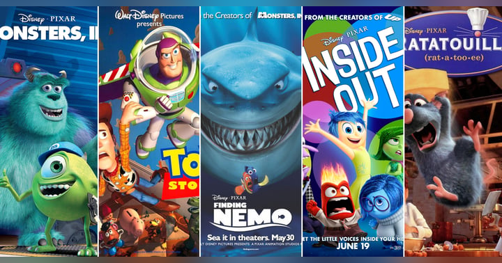
- Star Wars (1977) – Drew Struzan’s poster for Star Wars is one of the most recognisable in film history, with its heroic depiction of Luke Skywalker and Princess Leia set against a galactic backdrop.
- Indiana Jones: Raiders of the Lost Ark (1981) – Another masterpiece by Struzan, this poster captures the adventurous spirit of the film, with Harrison Ford front and centre in his iconic fedora.
- Jaws (1975) – Designed by Roger Kastel, the poster for Jaws is a masterclass in simplicity and suspense, showing only the looming shark beneath an unsuspecting swimmer.
Postmodern Experimentation: 1990s–2000s
By the 1990s, the rise of digital technology transformed poster design. While traditional hand-drawn posters were still created, many studios began using digital photography and graphic design software to craft sleek, modern posters.
This era also saw a rise in teaser posters—simple, often cryptic designs released before a film’s full marketing campaign began. Teaser posters relied on minimalism and mystery to generate buzz.
Notable Posters:
- Pulp Fiction (1994) – This poster, featuring Uma Thurman reclining on a bed with a pulp magazine and cigarette, became an instant pop culture icon, perfectly encapsulating Quentin Tarantino’s stylish, irreverent tone.
- The Dark Knight (2008) – One of the best examples of modern teaser posters, the haunting image of a shattered bat symbol covered in flames set the tone for Christopher Nolan’s darker, more realistic take on Batman.
The Digital Age: 2010s–Present
In recent years, poster design has continued to evolve alongside digital media. Social media platforms like Instagram and Twitter have influenced how studios approach marketing, leading to more visually striking and shareable poster designs. Minimalism has returned in many cases, with designers focusing on bold, simple imagery that conveys a film’s core themes at a glance.
Additionally, alternative poster designs—often created by independent artists and fan communities—have become increasingly popular, offering fresh perspectives on major films. Studios have begun to embrace this trend, commissioning alternative posters for limited releases and special editions.
Notable Posters:
- La La Land (2016) – The poster’s minimalist design, featuring silhouettes of the lead characters against a starry sky, perfectly captures the film’s dreamy, romantic atmosphere.
- Parasite (2019) – Bong Joon-ho’s critically acclaimed thriller had several striking posters, but the most memorable one features the family standing outside their house, with black bars covering their eyes—symbolizing the film’s themes of class disparity and hidden truths.
Conclusion
The art of the movie poster has come a long way—from simple text and illustrations to highly stylized digital designs. While technology has transformed how posters are made, the goal remains the same: to capture the essence of a film in a single image and spark excitement in the audience. Whether through hand-drawn masterpieces or sleek, modern minimalism, movie posters continue to be an integral part of cinematic history.
Next time you see a poster that catches your eye, take a moment to appreciate the artistry and thought that went into it—there’s more than meets the eye.
 Profile Photo")
The Video Shop Owner
Matt White, affectionately known as "Whitey" on the "Born to Watch" podcast, epitomises a cinematic sage. Classics like Star Wars, Jaws, and Willy Wonka and the Chocolate Factory sparked his passion for film at a tender age. These films not only captivated him but also moulded his path in life. While briefly flirting with creative arts himself, Matt soon realised his true calling was not in starring in or producing movies but in sharing them. This realisation led him to his true vocation as the guiding light for others’ film explorations.
Taking this passion to a professional level, Matt once owned a video rental store, turning a simple business into a thriving hub for movie enthusiasts. There, he did more than rent out films; he curated cinematic experiences. His shop became a local cornerstone where he imparted his vast knowledge, enthusiastically recommending films that catered to his customers' unique tastes.
Beyond the counters of his now-closed store, Matt's joy in movies is most vividly seen at home. Watching films with his kids, he delights in their reactions, finding profound satisfaction in passing on his love for movies to the next generation. On "Born to Watch," Whitey is more than a host; he’s a mentor, sharing his passion project with listeners and inviting them to join him on a journey through the world of film.
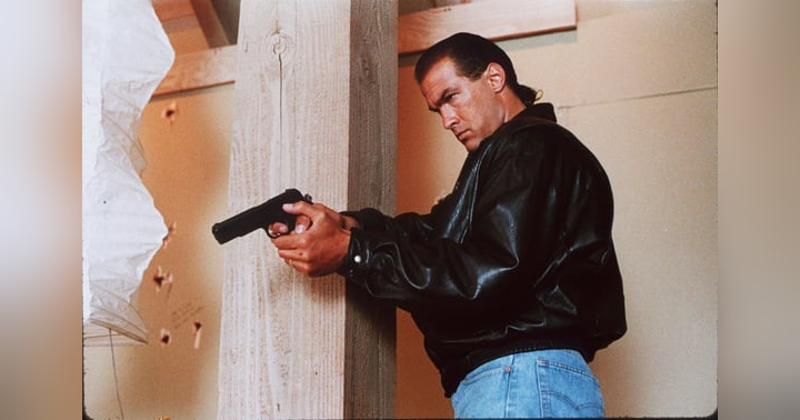
Hard to Kill Movie Review: Peak VHS Action or Peak Ego?